1、新建html文档。

2、书写hmtl代码。
<div class="zcc"></div>
<div class="zcc2">
<div class="left"></div>
<div class="right"></div>
</div>

3、初始化css代码。
<style>
html, body { width : 100%; height : 100%; margin : 0; padding : 0; }
.wrapper { position : relative; width : 420px; margin : 0 auto; padding : 0; font-size : 0; }
.icon { position : relative; display : inline-block; width : 100px; height : 100px; margin : 20px; border-radius : 18px; -webkit-box-sizing : border-box; -moz-box-sizing : border-box; box-sizing : border-box; }
</style>

4、书写css代码。
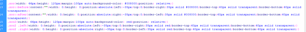
<style>
.zcc{width: 66px;height: 120px;margin:100px auto;background-color: #008000;position: relative;}
.zcc::before{content:"";width: 0;height: 0;position:absolute;left:-35px;top:0;border-right:35px solid #008000;border-top:60px solid transparent;border-bottom:60px solid transparent;}
.zcc::after{content:"";width: 0;height: 0;position:absolute;right:-35px;top:0;border-left:35px solid #008000;border-top:60px solid transparent;border-bottom:60px solid transparent;}
.zcc2{width: 66px;height: 120px;margin:100px auto;background-color: red;position: relative;}
.zcc2 .left{width: 0;height: 0;position:absolute;left:-35px;top:0;border-right:35px solid red;border-top:60px solid transparent;border-bottom:60px solid transparent;}
.zcc2 .right{width: 0;height: 0;position:absolute;right:-35px;top:0;border-left:35px solid red;border-top:60px solid transparent;border-bottom:60px solid transparent;}
</style>
5、代码整体结构。

6、查看效果。

